Problem/Need
Our previous marketing collateral used an illustrative look and feel, which was confusing, difficult to use and very disconnected from our High Net Worth (HNW) sub-brand. Our Creative Director identified a need to create a visual identity system and put together a team of three (himself, me as Art Director and our Senior Designer) to work together.
Strategy/Methodology
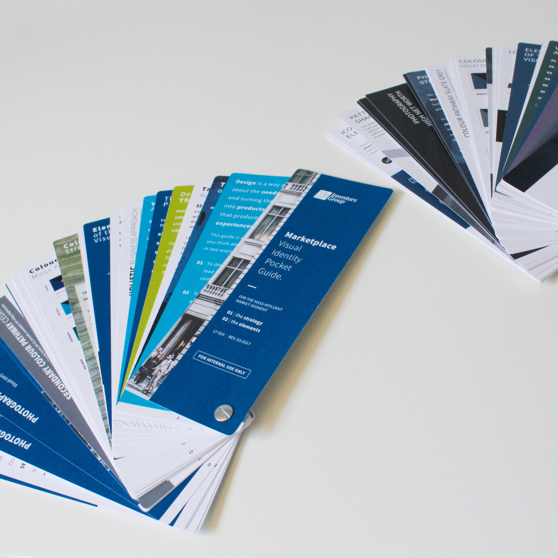
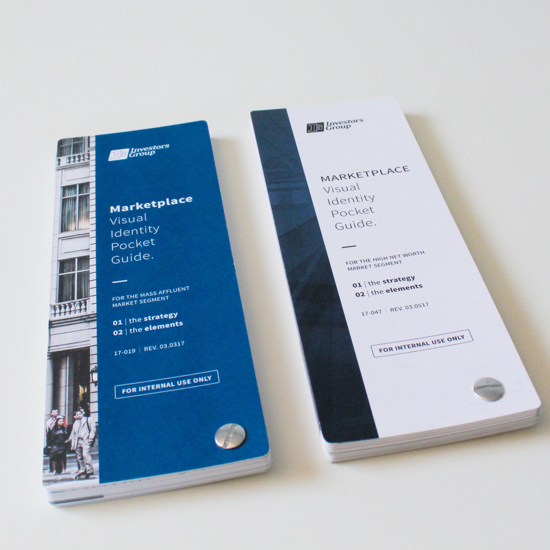
We started by having a day-long offsite meeting to review the previous visual identity, discuss what worked and brainstorm ideas for a more complete and usable design system. Over the next two months, we met regularly to discuss typography, photography, colour palette, iconography and other design elements. Once we had the system defined, we created 24”x40” posters for our office and reference guides for the design team and key stakeholders.
Solution/Contribution
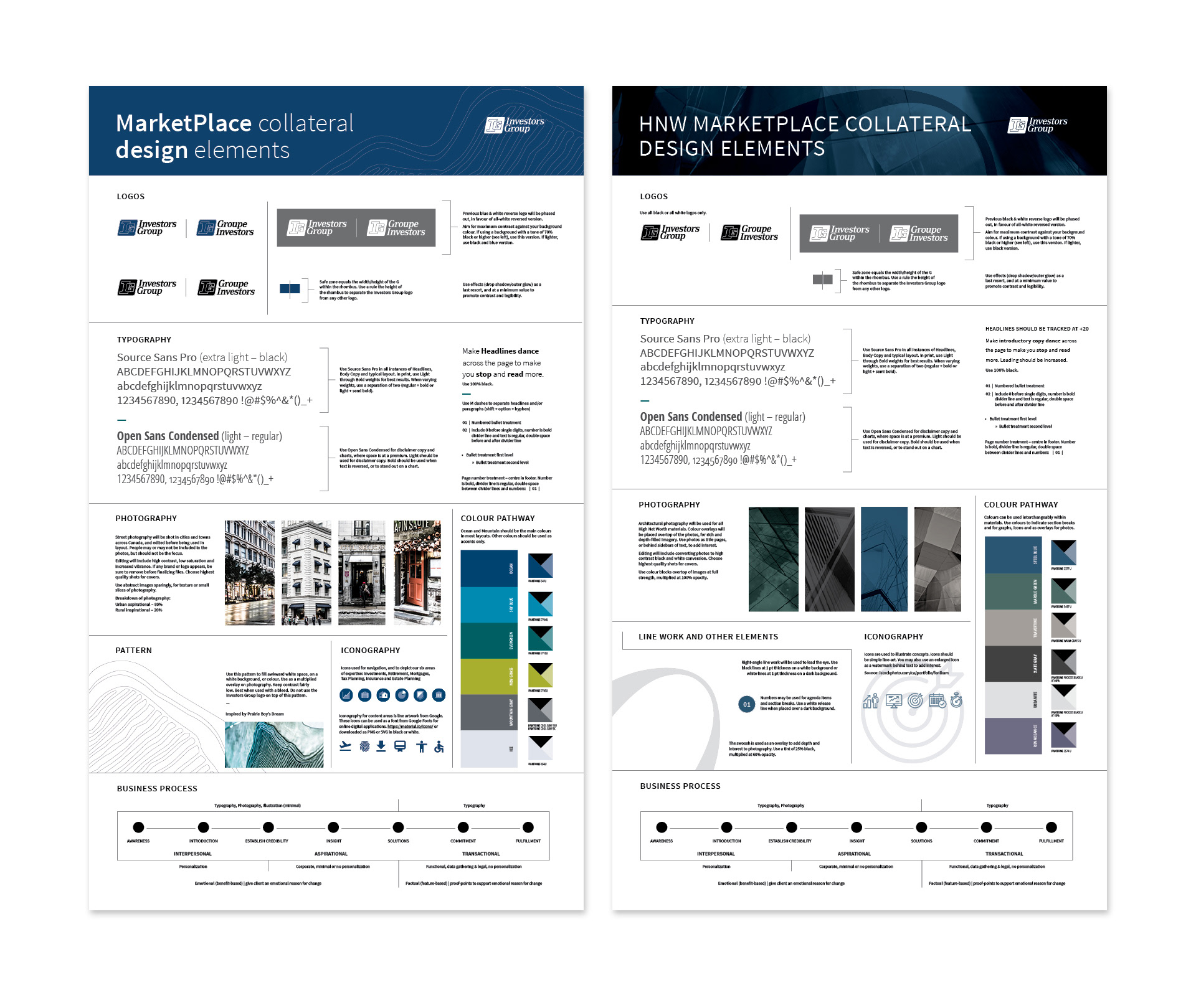
Investors Group is a truly Canadian brand and as such, we worked to incorporate Canadian elements into the photography, the colour palette and the pattern.
For the Mass Affluent (MA) brand, we used street photography mixed with rural areas, in order to showcase that our clients are located in every corner of the country. The photos were edited to have high contrast, low saturation and increased vibrance. For the High Net Worth (HNW) brand, we selected architectural shots with multiplied colour overlays to create rich and depth-filled imagery. Using photos like these would allow us to really ‘own’ the photography and gave it a polished feel.
The MA colour palette was inspired by the Canadian landscape, with colours we called ocean, sky, evergreen, new grass, mountain and ice. The HNW colour palette was inspired by the architectural photography, using names like steel blue, marble green and slate gray.
The MA pattern was inspired by a large art installation in the atrium of our head office, called “Prarie Boy’s Dream”. The artwork was modelled after aerial views of prairie landscapes and farmer’s fields. We created a line-art version, which we used when we had awkward open spaces, and to add texture and depth to a piece.
Icons and type were kept simple and clean to allow the other design elements to do the heavy lifting.
Results/Impact
By creating standards and using them consistently, we began to see internal partners aligning with the designs much faster and with less versions. Design projects became easier for the team to implement because they had guidelines and templates to draw from. External work was easier to manage as well, as everyone was working from the same playbook.
This work was unfortunately short-lived. About 6 months after implementation we had a full corporate restructure and 12 months after implementation we began a company-wide re-brand effort.
Acknowledgements
Creative Director: Darryl van Herksen
Art Director: Amanda Parker
Senior Designer: Sharri Zarvie