Problem/Need
People don’t typically see Winnipeg as a dynamic destination, so we needed to motivate them to sign up for the conference. The main objective of the project was to ensure that attendees of the conference would know that it was the right place for them to be.
Strategy/Methodology
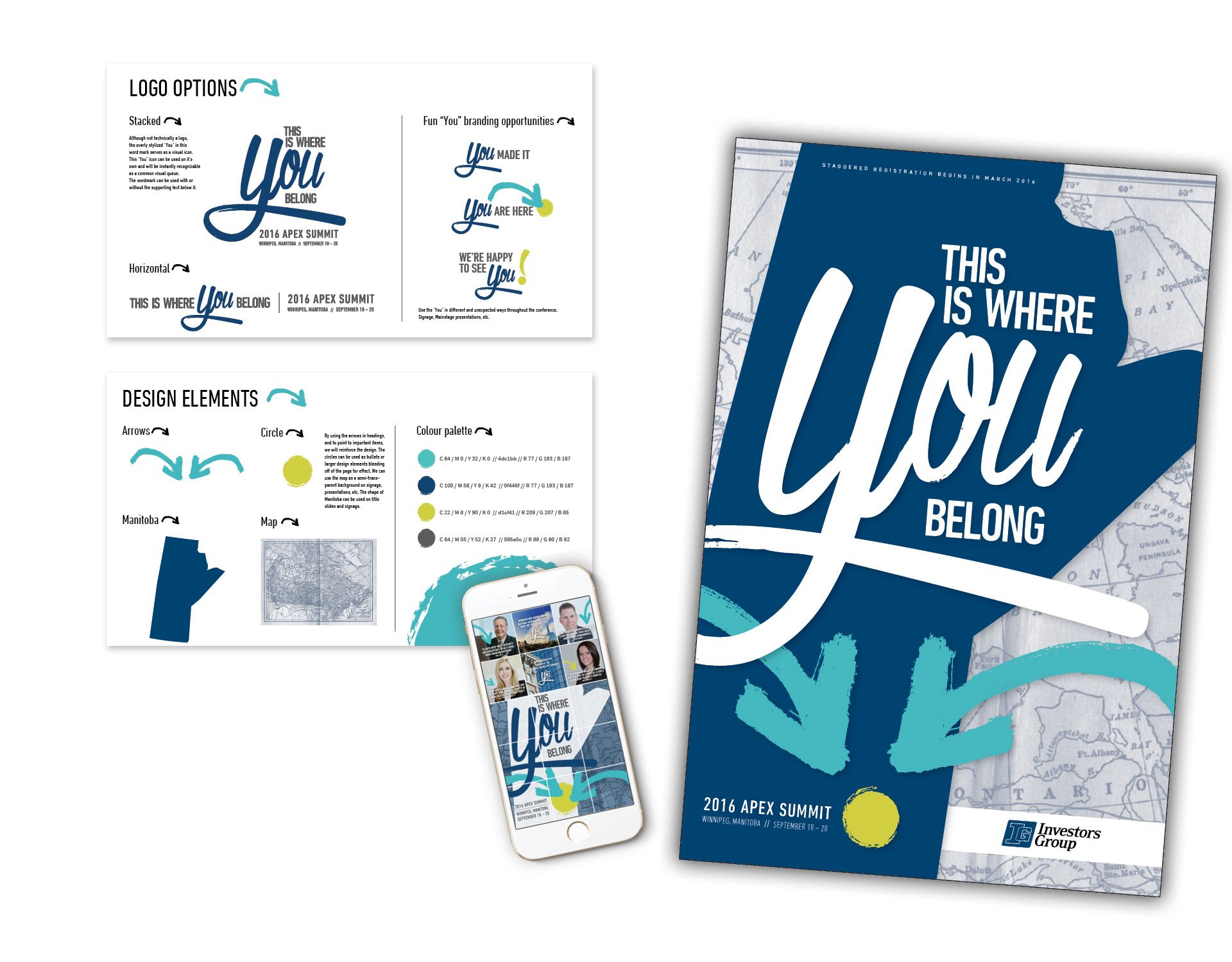
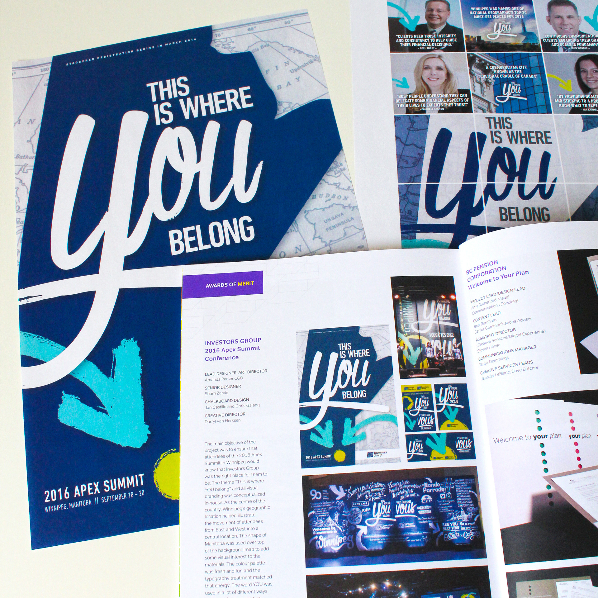
The conference visual identity was created to work with the theme. A word mark was designed, then a poster to promote the conference, and later a branded instagram feed and a large number of print and environmental design pieces were created using the brand guidelines.
The word YOU was used as a playful branding tactic for the conference creative: for hotel keys, “This is where YOU stay;” for the Educational Tracks, “This is where YOU learn;” for banners outside the lunch room, “This is where YOU eat.”
Solution/Contribution
The poster and word mark show movement and promote this conference as a dynamic place to be. As the centre of the country, Winnipeg’s geographic location helped illustrate the movement of attendees from East and West into a central location. The shape of Manitoba was placed on top of an old atlas map to add some texture and visual interest to the materials.
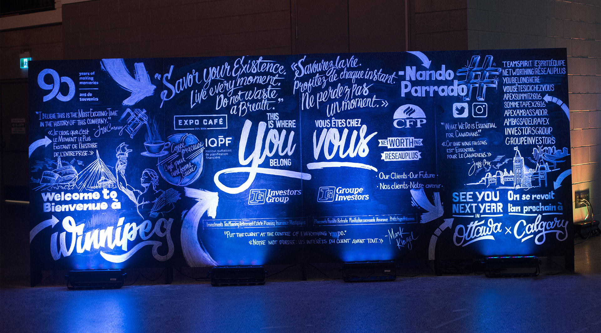
The colour palette was fresh and fun and the custom typographic treatment matched that energy. All of the creative elements came together in a large-scale way on-site at the conference with various banners and environmental displays created by my team, including a 10’ x 6’ custom chalkboard, where I worked with two very talented designers/chalkboard artists to bring my vision to life.
Results/Impact
The conference was sold out, and this project won the 2017 RGD In-House Award for Branding.
Acknowledgements
Art Director: Amanda Parker
Senior Designer: Sharri Zarvie
Chalkboard Artists: Jan Castillo and Chris Galang
Theme “This is where YOU belong”: senior leadershipMap: iStockPhoto