
Problem/Need
To develop an annual corporate report, outlining Investors Group’s community-related initiatives. Distributed to Investors Group clients, employees, sales force and corporate/community partners.

Strategy/Methodology
I really leaned into our community tagline at the time: "People who care". This report showcased people who care, across the company and country. Special typographic treatments helped signify section starts, and swash elements were used to emulate the “People who care” scripted wordmark (as shown on the cover).
Solution/Contribution
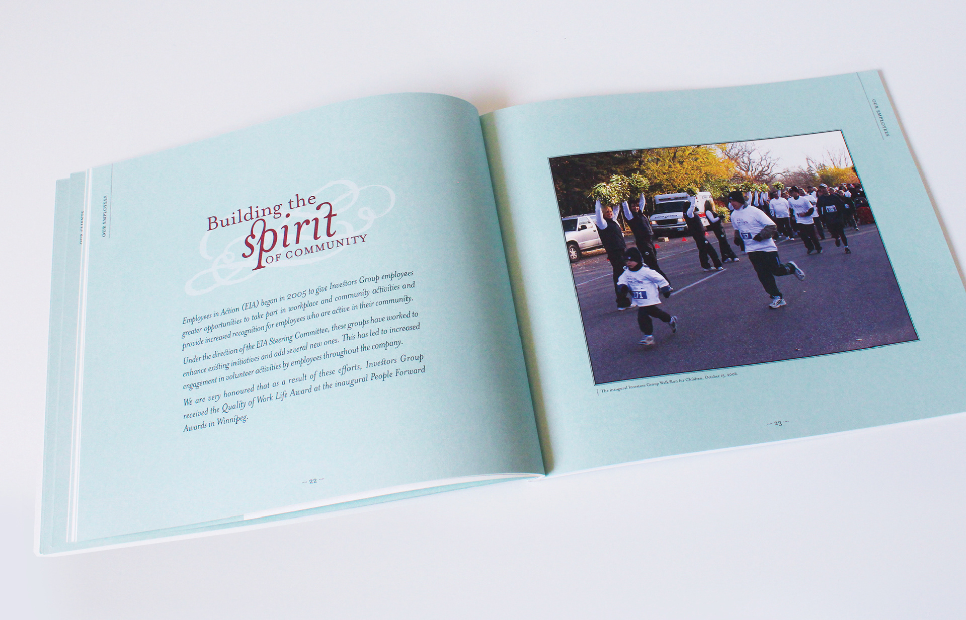
In order to create a feeling of warmth and comfort for the reader, I used a combination of paper stock, colour palette and typography. The colour palette of powder blue and deep red worked beautifully with the natural cream uncoated paper stock. I used an 8.5”x10” layout to make this piece feel custom and special. Mrs. Eaves font was used throughout, which has many variations, including ligatures. Many of the photographs used in the report were taken by me, as I was also the corporate photographer at the time (all photography on this page is my work).
Results/Impact
The final, perfect-bound printed piece is still one of the most impressive pieces I’ve worked on to date, and was a piece I had full creative control on.
Acknowledgements
"People who care" wordmark was provided. All design decisions were my own, including typography, layout, colour palette, paper stock and photography. I was also the corporate photographer at the time and took many of the photographs used in the report.